Creating a Bar Chart using SPSS Statistics
Introduction
A bar chart is helpful in graphically describing (visualizing) your data. It will often be used in addition to inferential statistics. For example, a bar chart can be appropriate if you are analysing your data using an independent-samples t-test, paired-samples t-test (dependent t-test), one-way ANOVA or repeated measures ANOVA. If you are using a chi-square test for association or a two-way ANOVA, you will need to consider a clustered bar chart instead (N.B., if you need help creating a clustered bar chart using SPSS Statistics, we show you how in our enhanced content).
The purpose of this guide is to show you how to create a bar chart using SPSS Statistics. Before we show you this SPSS Statistics procedure, we introduce you to the example we have used.
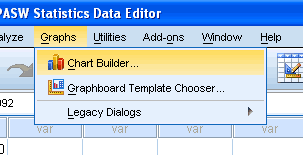
Click Graphs > Chart Builder... on the top menu as shown below:
Published with written permission from SPSS Statistics, IBM Corporation.
-
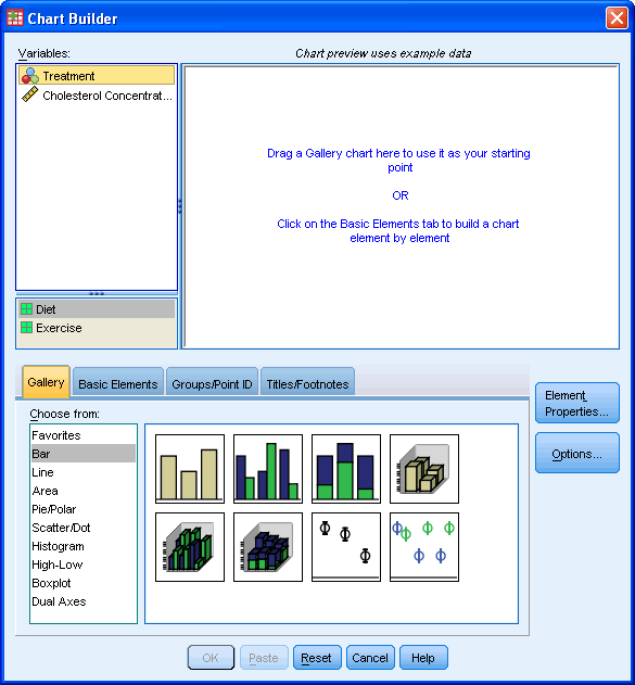
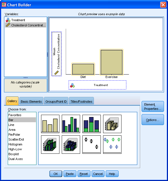
You will be presented with the following screen:
Published with written permission from SPSS Statistics, IBM Corporation.
-
Under the Gallery Tab ( ), select the Bar option and the simple bar chart icon (top-left icon). Drag-and-drop this icon into the Chart Preview Area. ), select the Bar option and the simple bar chart icon (top-left icon). Drag-and-drop this icon into the Chart Preview Area.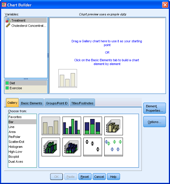
-
Published with written permission from SPSS Statistics, IBM Corporation.
-
You will be presented with the following dialog boxes: Chart Builder and Element Properties. As you can see, the Chart Preview Area has been populated with a template of a simple bar chart.
- Published with written permission from SPSS Statistics, IBM Corporation.
-
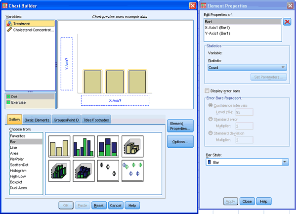
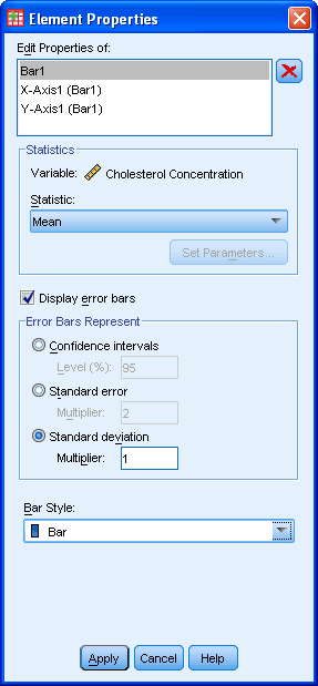
Transfer the independent variable, Treatment, into the "X-Axis?" box and the dependent (outcome) variable, Cholesterol Concentration, into the "Y-Axis?" box within the Preview Chart Area by drag-and-dropping the variables from the Variables: box.
-
Ideally, we want to be able to show a measure of the spread of the data. In this case, we wish to have error bars that represent ± 1 standard deviations. To do this, we tick the Dispay error bars checkbox and then, under the -Error Bars Represent- area, we check the Standard deviation radio box, and in the Multiplier:, enter "1".
Published with written permission from SPSS Statistics, IBM Corporation.
-
Click the  button. button.
-
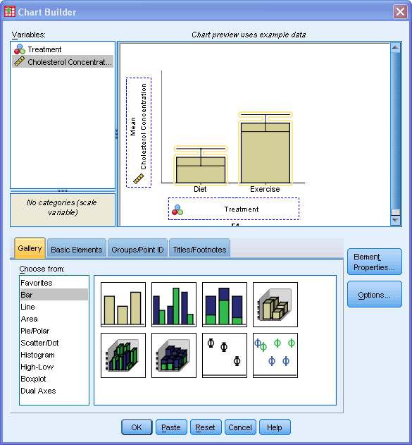
You will be presented with the following screen (showing the error bars added in the "Chart Preview Area"):
-
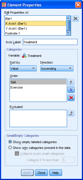
We do not need to do anything in the following screen in this example. However, it does present some options which you might find useful. You can use the  and and  to rearrange the order of the categories and the to rearrange the order of the categories and the  button to exclude a category. If you make a mistake and exclude a variable you later want to include, you can simply click the button to exclude a category. If you make a mistake and exclude a variable you later want to include, you can simply click the  button in the Excluded: box. button in the Excluded: box.
-
If you make any changes, remember to click the button.
-
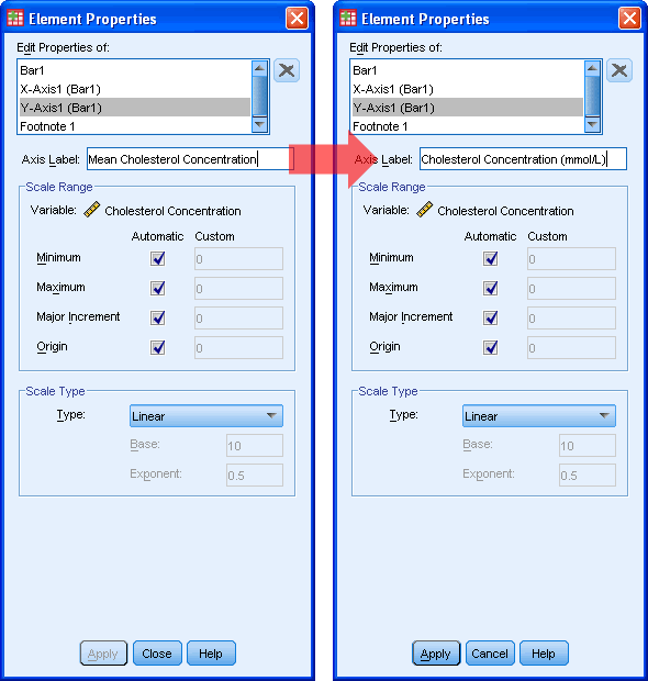
We want to change the y-axis label so that we can remove the "mean" text and add in some units of measurement. We do this by selecting "Y-Axis (Bar1)" in the Edit Properties of: box and then change the Axis Label: as below:
-
Click the button.
-
Click the  button. button.
|